Probably the last thing I need is new inspiration, drowning as I am in my oft-mentioned haul. However the lovely etsyan
lorelei1141 contacted me recently to say she liked ...
on a whim, and b/c she had such a nice avatar, I poked over to her shop and discovered a world of color.
A freedom in unexpected unions of glazed greens, browns, copper, earthy mustards, corals and every kind of blue. Nothing looking over or underdone, supremely wearable, gorgeously multi-chromatic.
Now, if you are a jewelry nut, you will recognize some of these elements as what's popular these days. She often uses components made by other artist, such as resin charms in copper and jaw-droppingly sexy ceramic versions of a badonkadonk.
However, I have yet to see someone do something to these components that improves on the component. So many of these would look better alone or a couple on a cord tied around your back. Often, what folks made even detracted from the beads and bits.
It takes a real designers eye to make them shine. Just like you can't stick any few cute antique bits on a chain and expect them to look good, it's the same w/artist-made components.
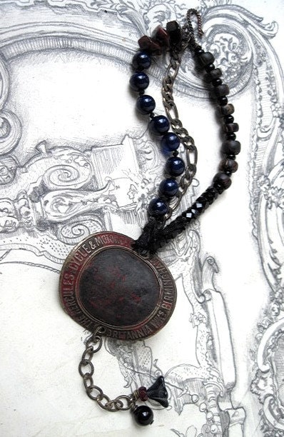
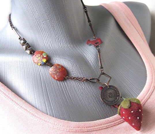
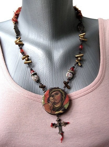
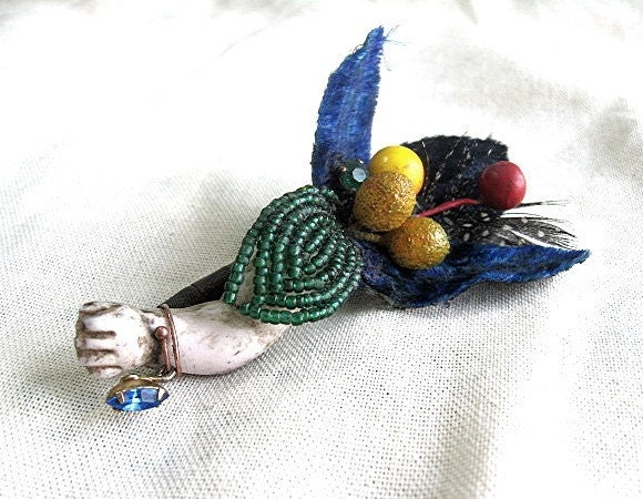
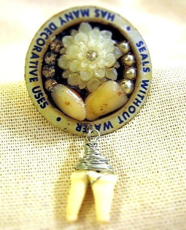
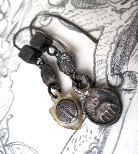
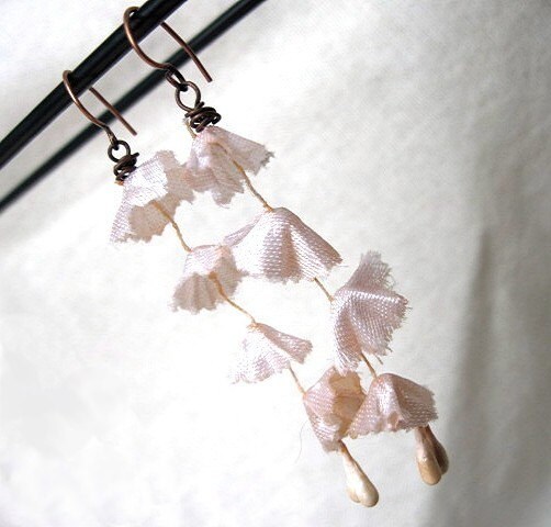
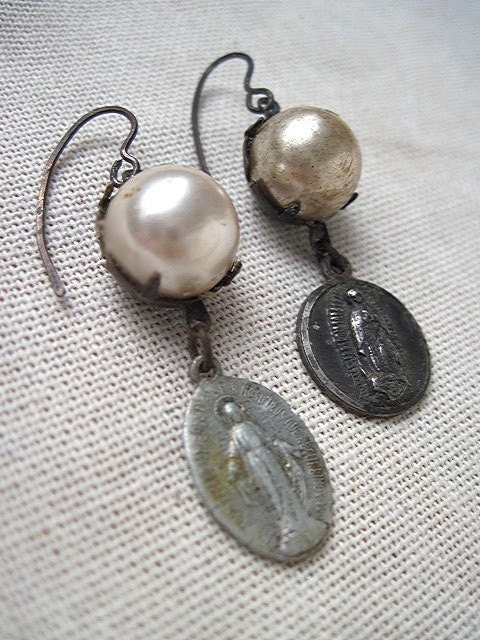
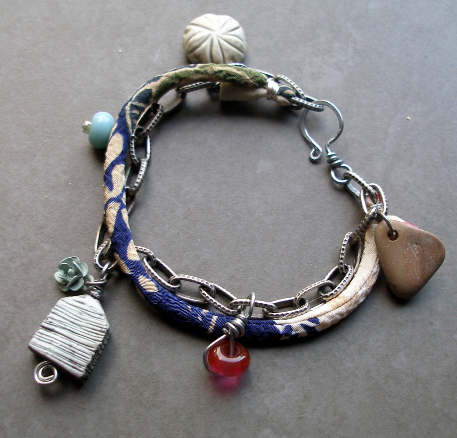
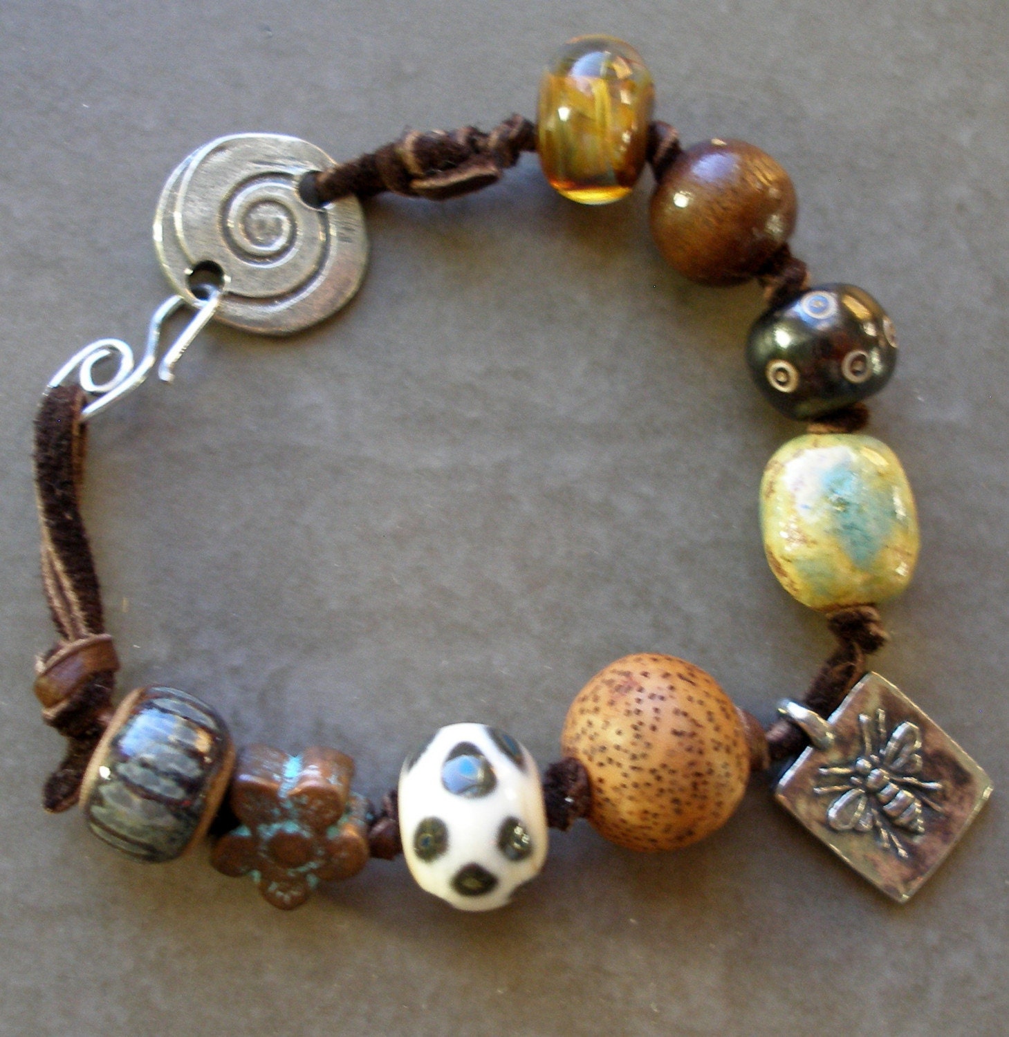
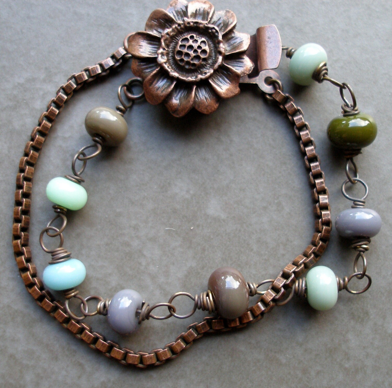
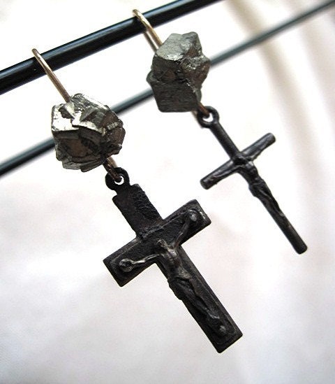
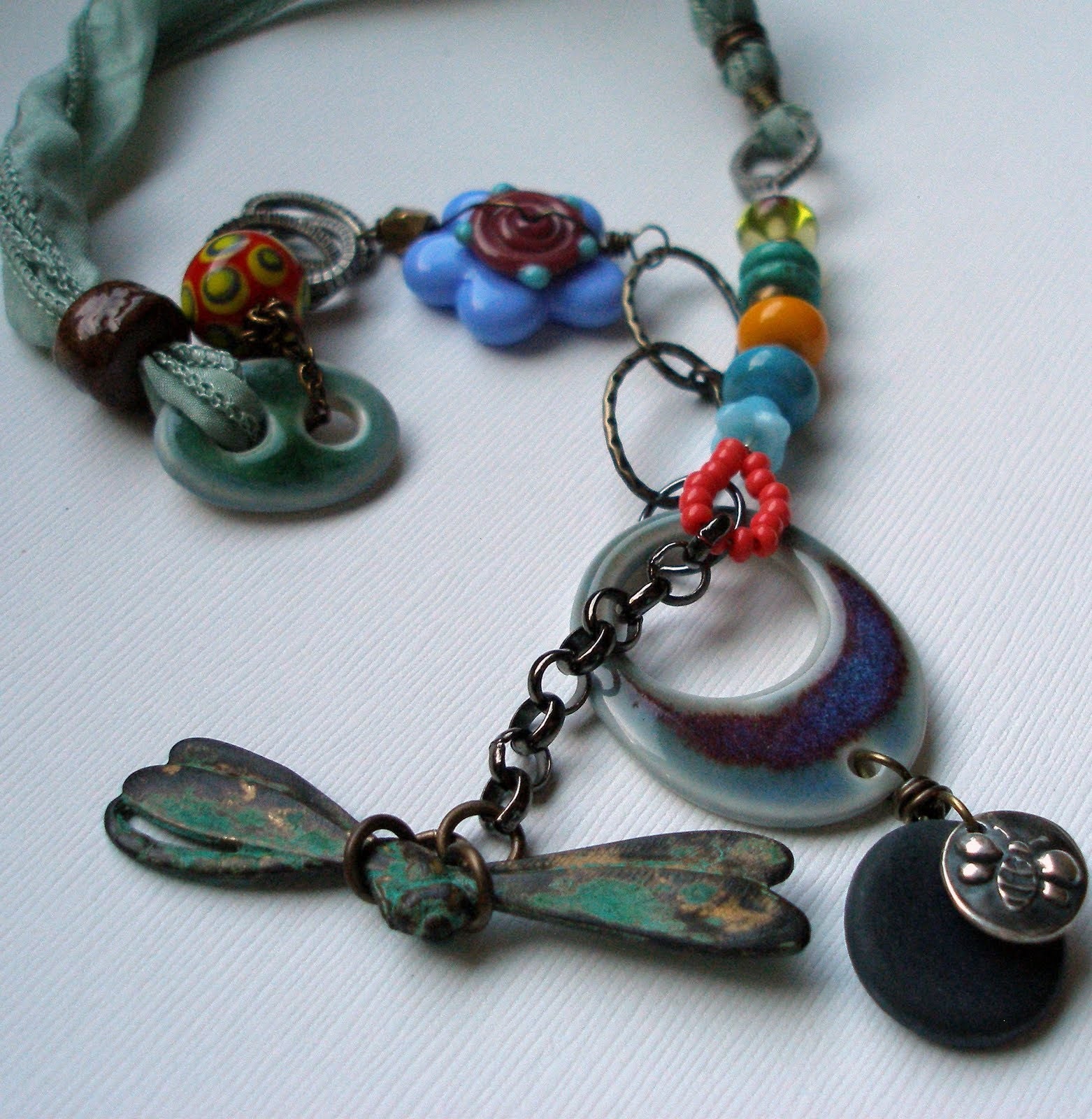
What most makes me sit there w/my mouth hanging open, though, are those unexpected touches of color. The piece right above here is entirely unexpected color. Who told her she was allowed to bring a big ol' shiny purple bead into that subdued, kind of rustic composition? Or the green in the 1st piece, or red in the second.

Or not do any repetition w/the red or black above?
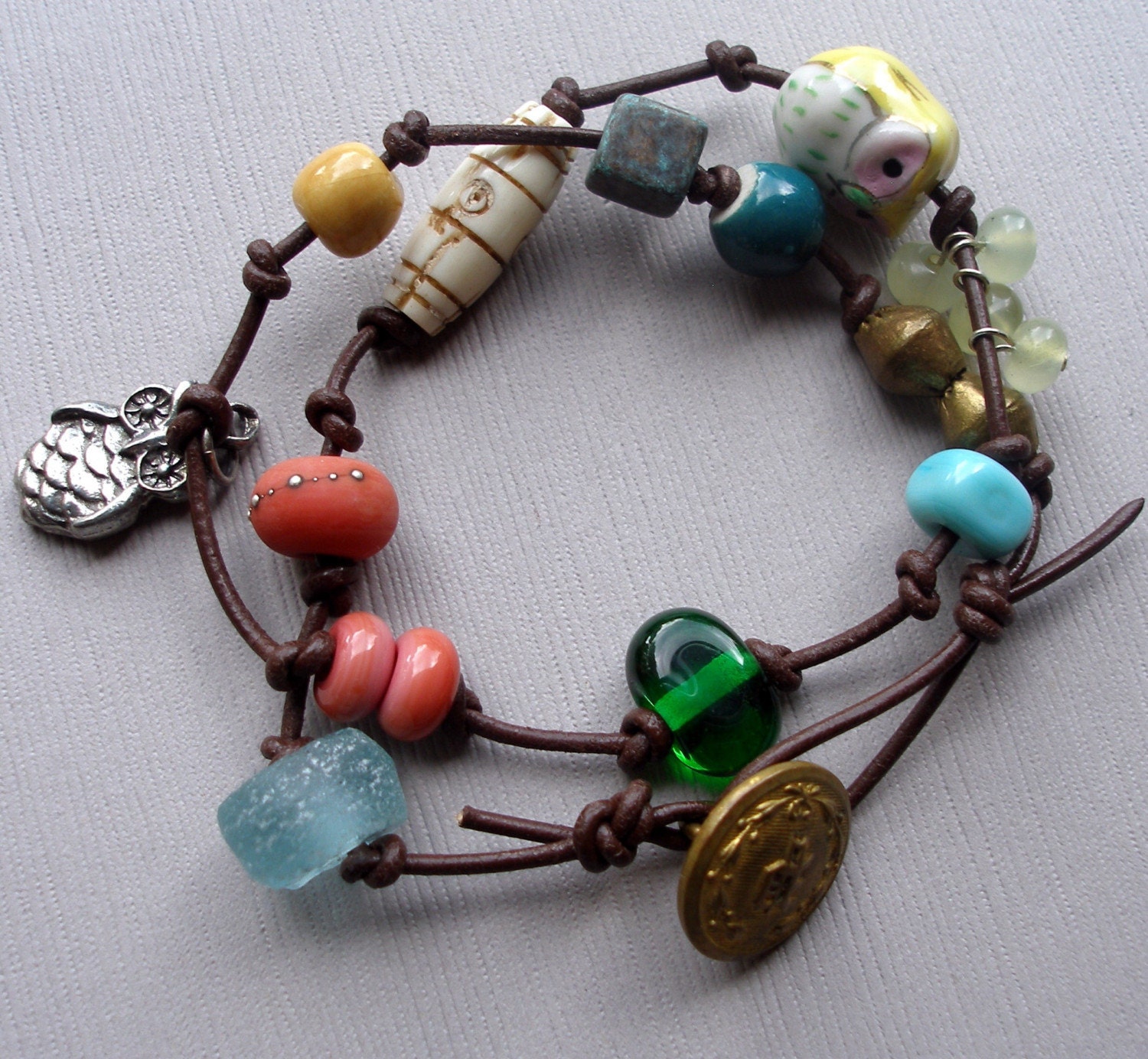
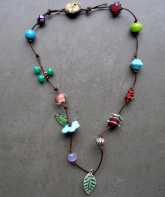
Or the sudden bright seed beads below? Not to mention the sudden appearance of a big blue flower, never again to be repeated, and a big spotted lampwork round, never again to be repeated.
Meanwhile, I've been sticking to this matchy-matchy thing. If I have a component w/yellow and red, everything has to be yellow and red:

OK, looking at this necklace, I did put in lots of surprises, since no element was repeated. The amber and tiny hints of orange bring in a sunset-flavored tough. But what if I'd gone w/royal blue?
One trick is to vary the color, but stick w/the same intensity and hue. (Remember, the hue is the amount of white and black mixed into the color.)
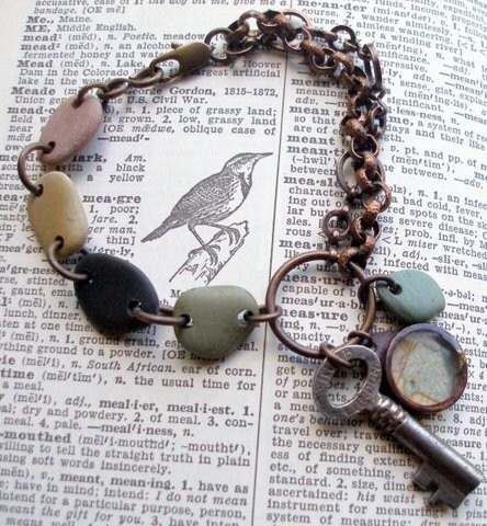
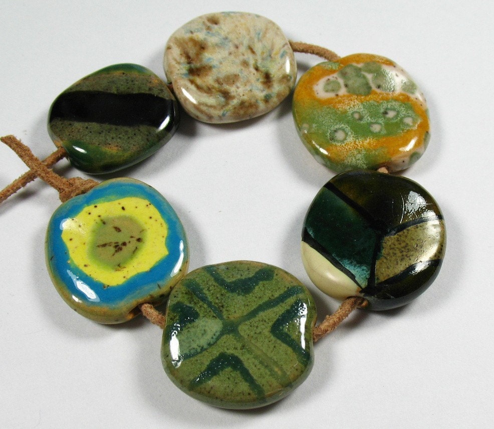
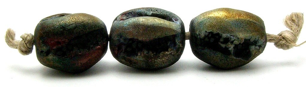
When hues are the same, if you turned the image to black and white, they'd all look like the same color. Which is very evident in this stone series above. But what about this below? It's even better than the stone series, color-wise.
AND IT CLEARLY HAS VASTLY VARYING HUES-- (this just added when i realized my post made no sense). Just imagine it black and white and you'll see what i mean.
Maybe I should just steal her color-ways. Which is impossible because my stash is what it is. And I'm not ready to pay $6 for one bead.
These are $24 for the three.
ANYWAYS- another thing
lorelei inspired me w/is the whole series of beads thing. Specifically, the series on a knotted cord. Led me to:

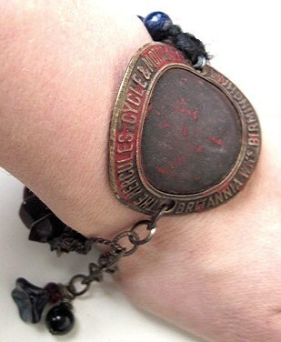
In which the navy was not in the focal, but still worked. I'm so proud. I'll be more so when I finish and get a good picture. The metal tag is, of course, from my famous haul. And the effect is still quite "me." I had been trying to get this guy to work w/just different kinds of metal chains and stuff, and it was awful. So now I have 4 or 5 projects going w/all knotted cord. Yuppeeee!!!