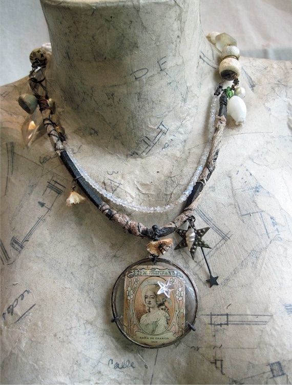
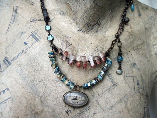
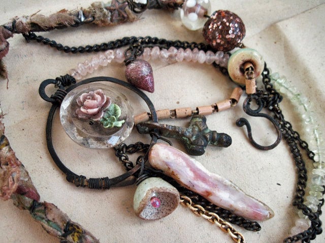
A luxurious, opulent piece made with one of many thick, magnifying eyeglass lenses I brought back from you-know-where.
Actually, I mounted it in a way that made me feel mildly ingenious. I took 2 brass rings-one just a teeny bit smaller than the lens, the other noticeably smaller. I bent them with my handy pliers so that they tilted- the inner edge of each ring angled higher than the outer. I placed the smaller ring under the glass and the larger on top. I kept them in position temporarily with 'clamps' of wire.
Ok, so I have this thick, mega-hard wire I can never use for anything because it's so dagun hard. I slowly worked it into 'c' shapes, got it around the glass and both hoops, pressed them down tight, clipping off any extra of the wire ends against the glass until I got a snug fit. I left a teeny space in the top 'c' for a wire, so I could connect it to the necklace. Believe it or not, it's really strong. Then I just went to town, throwing everything I could think of at it. That included a strand of gorgeous moonstone rondelles with a violet flash that ... well, doesn't exactly match as well as it could... but I'mna think of it as my curveball in the design. Or something.
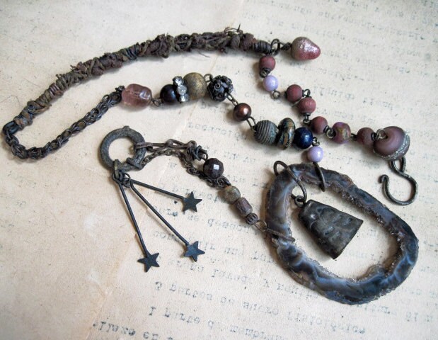
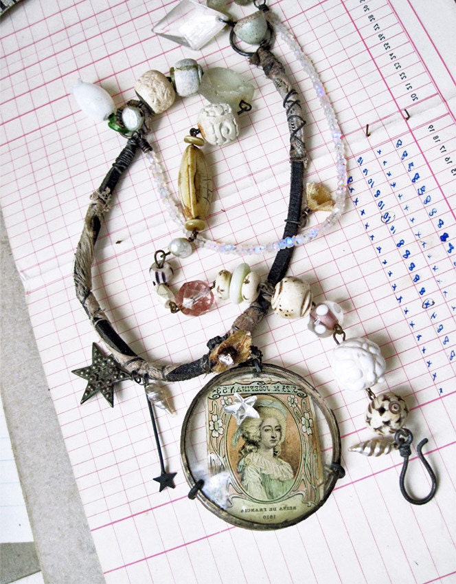 Also, a bunch of the ceramic chunkies Spirited Earth send me, some rags wrapped around a thick bad-ass leather cord for the grungy masculine touch, and even a couples stars. Ehh?
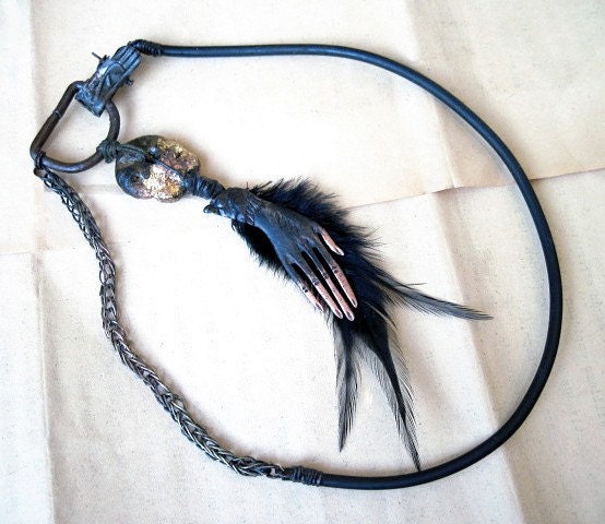
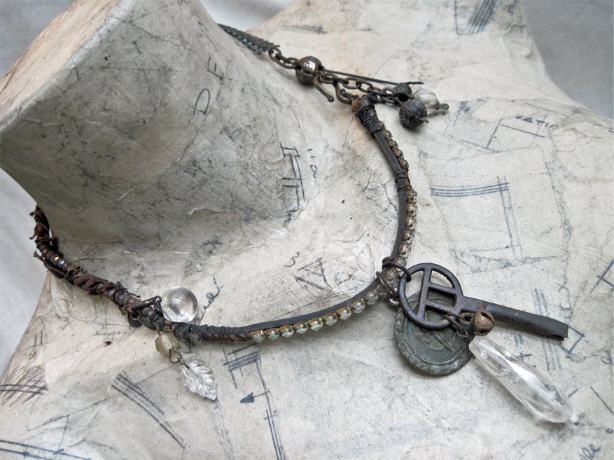 Belphegor.
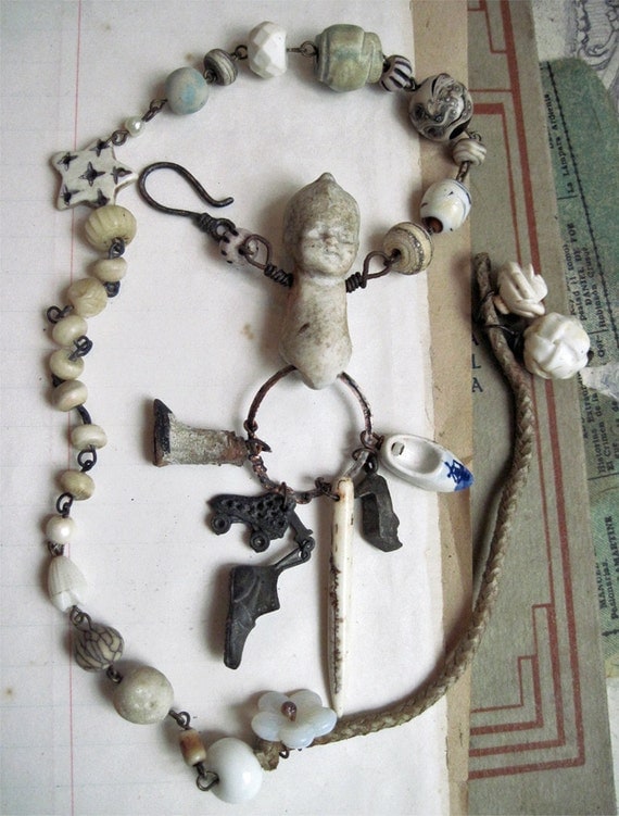
Die Wichtelmänner.
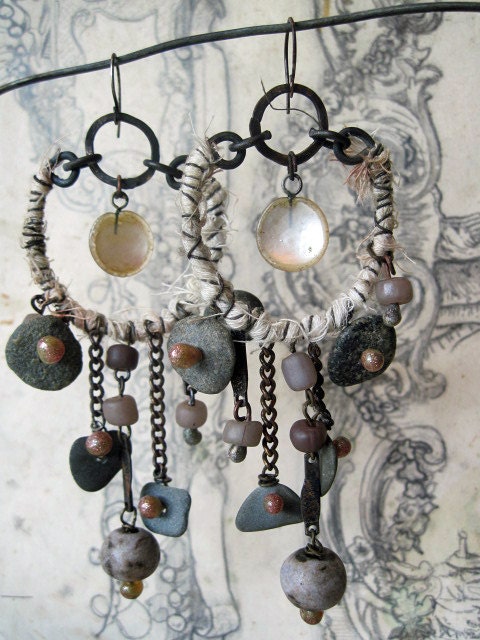
And a here's a cobbler elf.
Have you noticed the influence of Sparrow's amazing backgrounds post in these shots? Yeah, she's got me sweating. Barely a clue what I'm doing. What I'd like to know is why all my pictures look like they were taken during Nuclear Winter? You know? Or, like, on a day so overcast it might as well be nighttime? Anyone?
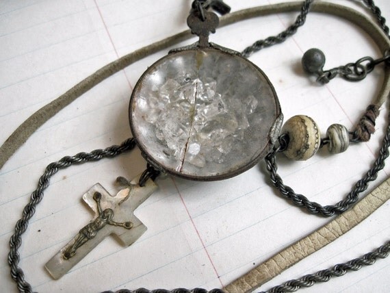
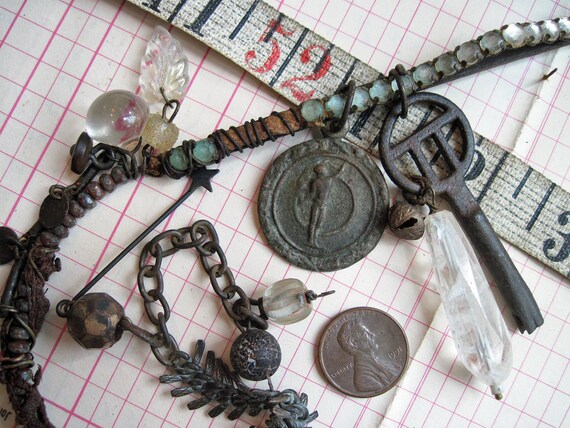
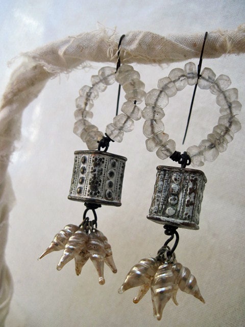
We Are Stardust.
You guys ever wake up with a word or phrase rolling 'round your head? I do. Sometimes, it's the name of some athlete I overheard from the hubs' TV watching and I lament the precious brain real estate given over to such crap. One day it was "Les Fleurs du Mal" which inspired me to look it up and quote Baudelaire in a bunch of listings. A few days ago it was "cagastric" one of my archaic words (of diseases, originating under an ill star). Then yesterday it was "catgut." Seriously. Today it was "we are stardust," which I liked for the piece above. I find it a very lovely, evocative phrase.
And here's it's grayer sibling:
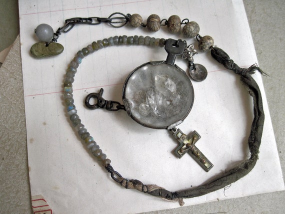
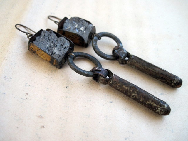
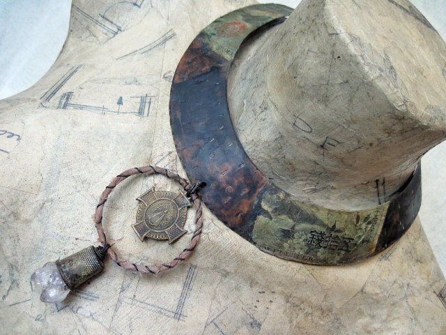
Mammon.
Oh, I had some very constructive feedback on this piece I've been having struggles with:
 Shibui said, "I think that maybe what you are missing in the horseshoe necklace is that the focal leaf on the bottom is too lightweight for the rest of the piece. Do you have a metal disk or something you could add to that part to make it look heavier?"
But then Sparrow convoed, "I think you're having problems with it cause it's too stretched out, visually. What if you flip the whiskey label around so it curls around the leaf bit, then add bits to the ends. I have attached an expertly executed photoshop to illustrate my point."
On the one hand, Shibui's idea is super do-able but I worry it's not enough to un-'meh' it. On the other hand, Sparrow's I like because I love looking at something in a totally new way but- I think the leaf bit is too big to 'fit' within the brass piece. Which means I'd have to re-do the entire focal. Though I do love the idea of hanging bits off the ends. Maybe I should remove the brass piece altogether, despite it's being the best part of the necklace. Hmmm. If I did that, I could still back it with a metal disc as Shibui suggested. Then I could use the brass piece on a totally different thing in the upside down position Sparrow suggested!!
Wow. I just resolved this as I was typing.
Cuz they really were both great ideas.
Any time you guys wanna help out, PLEASE do! That was awesome.
Jewelry by committee: the next trend in the craft-o-sphere.












4 comments:
Arg! You showed the world my horrific photoshop! Luckily I did it bad enough so everyone would know I didn't try.
If the leaf doesn't fit, maybe take out the dark bit behind it? Replace it with some tin. I think the weightiness problem that Shibu mentioned is valid too- even just from a visual point of view. That whisky brass is so in-your-face though, I can see how it holds everything to ransom. I have elements like that, every thing I use them on just gets owned.
And yay fancy backgrounds! The one under the boot boy is RAD. Your white balance might be the problem with the nuclear winter vibe, have a look at different settings.
love what you did with those light beads...
for some strange reason the blog today seems possessed..the text is just a line of single letters down the left side..
I'd go for layering more with this piece. The colors are exquisite, but I agree that the pendant needs beefing up. Now I just can't bring myself to suggest more, because I stand in awe of your creative boldness, and would rather see how YOU solve this problem. I'll bet we all learn from that, when it happens.
Brilliant!! Again...
Post a Comment